A takeout that stands out; a fresh and solid brand ecosystem.
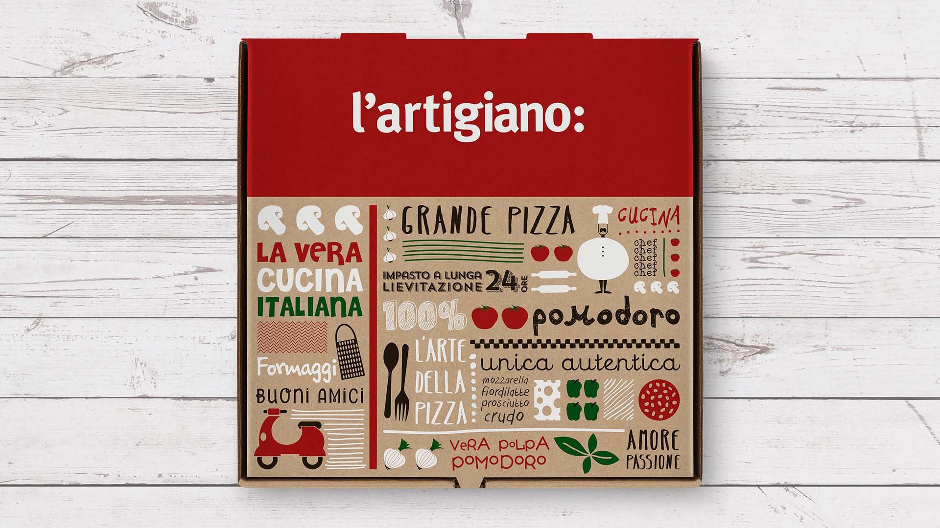
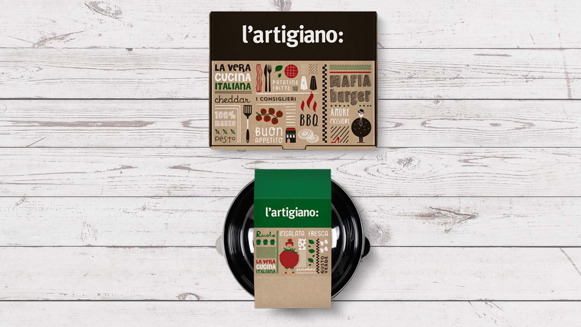
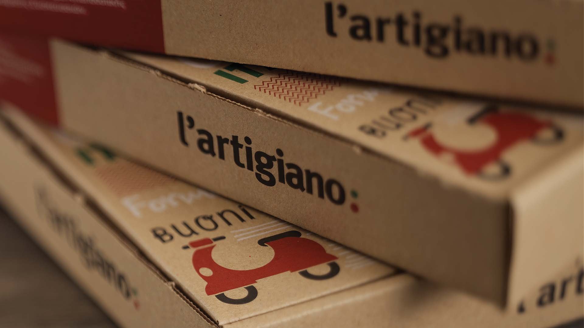
L’ artigiano is a chain of Italian food delivery restaurants. Traditional recipes, quality ingredients and freshly prepared meals have been part of L’ Artigiano’s brand promise for years. When the company decided to reduce the production cost and ecological footprint of the packaging, the rebranding had to highlight the richness, authenticity and joy of Italian food made in L’ artigiano kitchen.

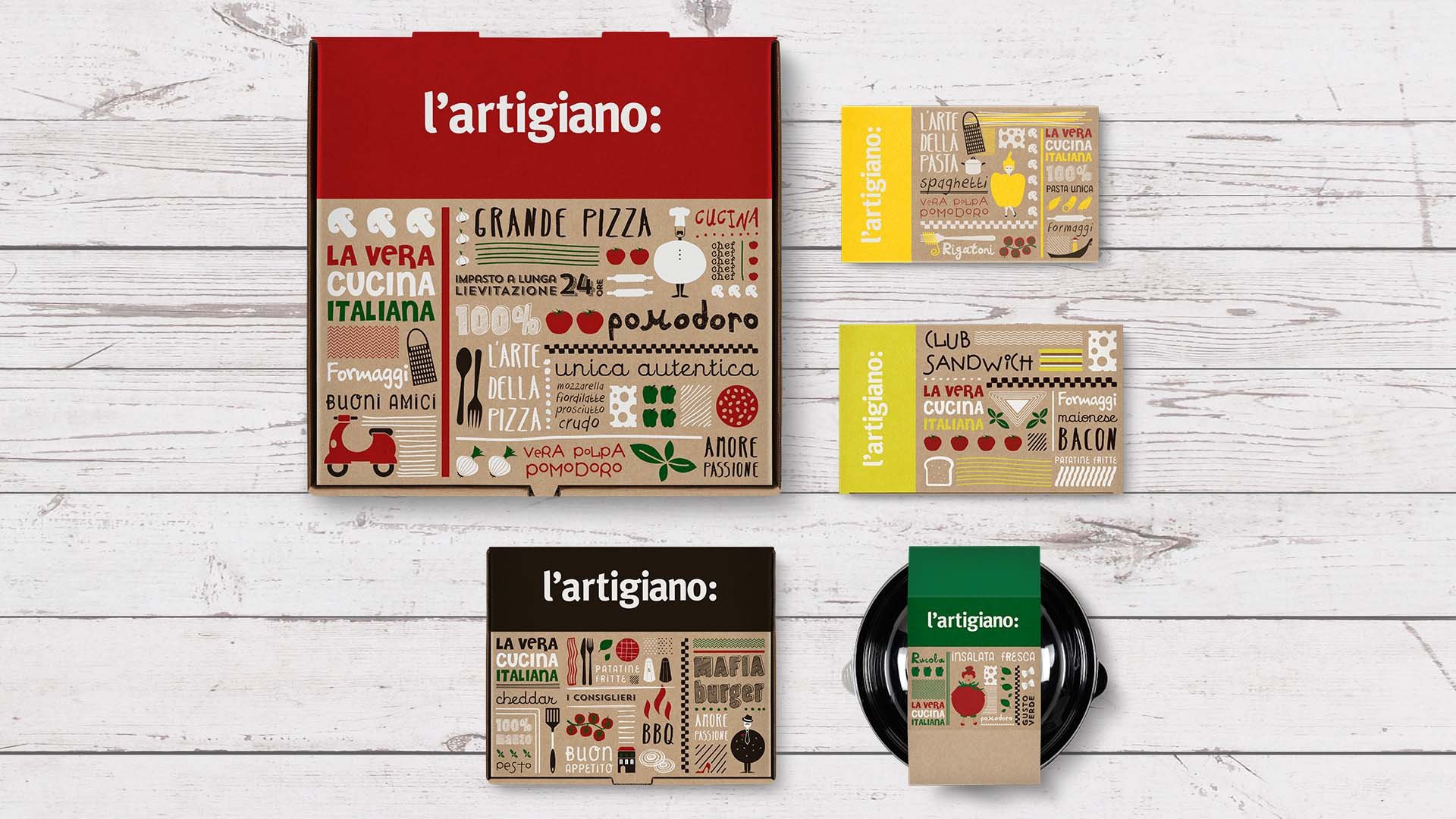
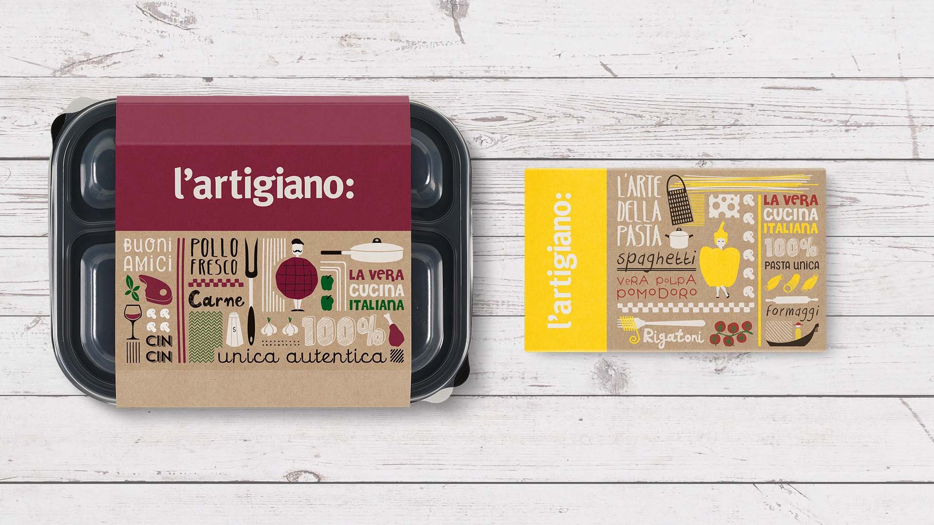
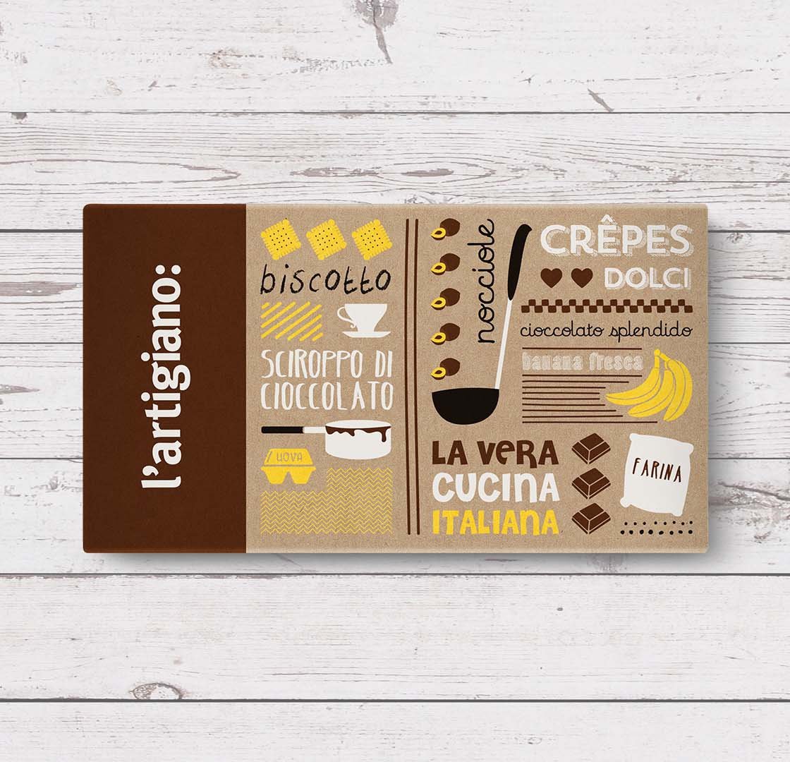
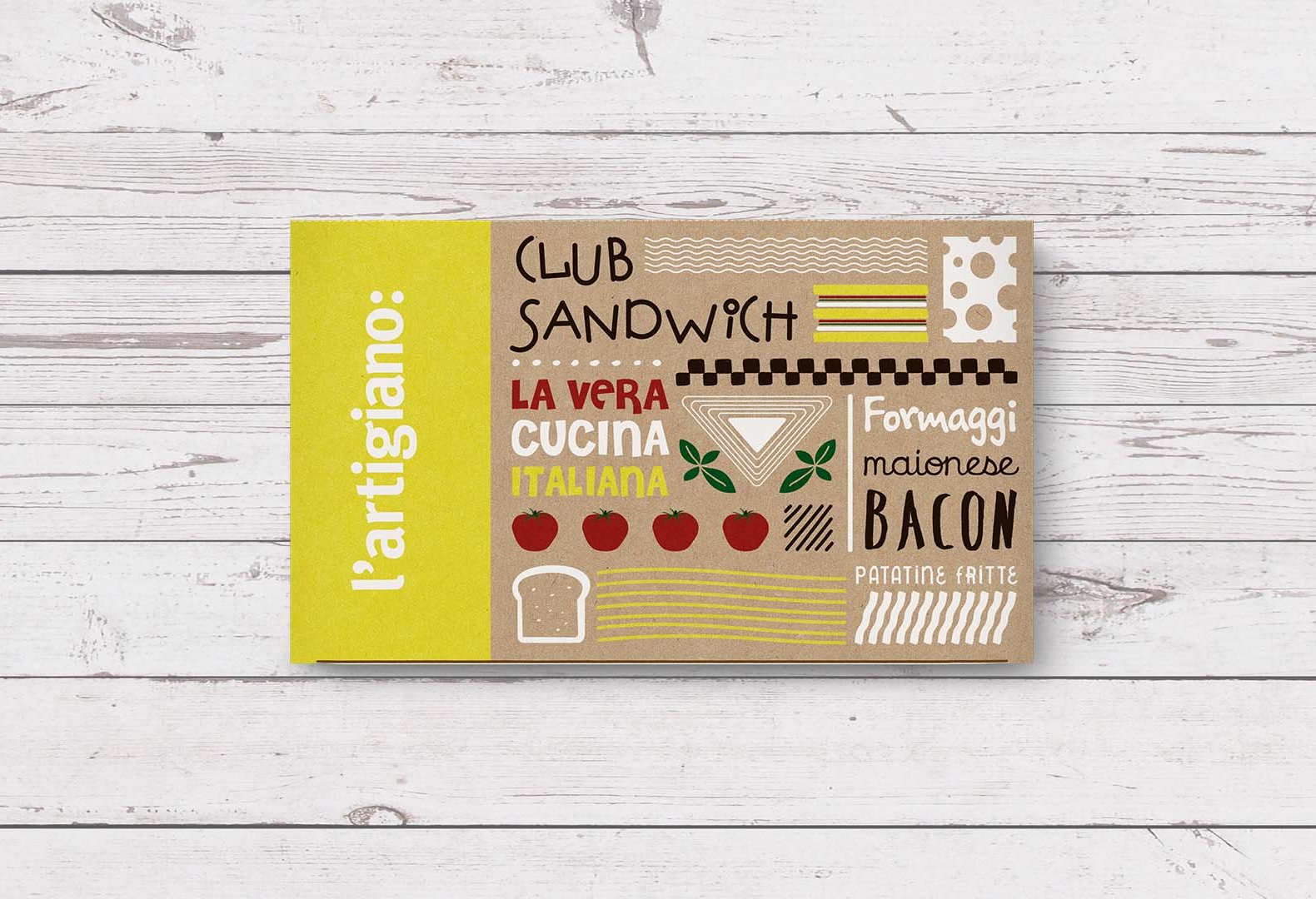
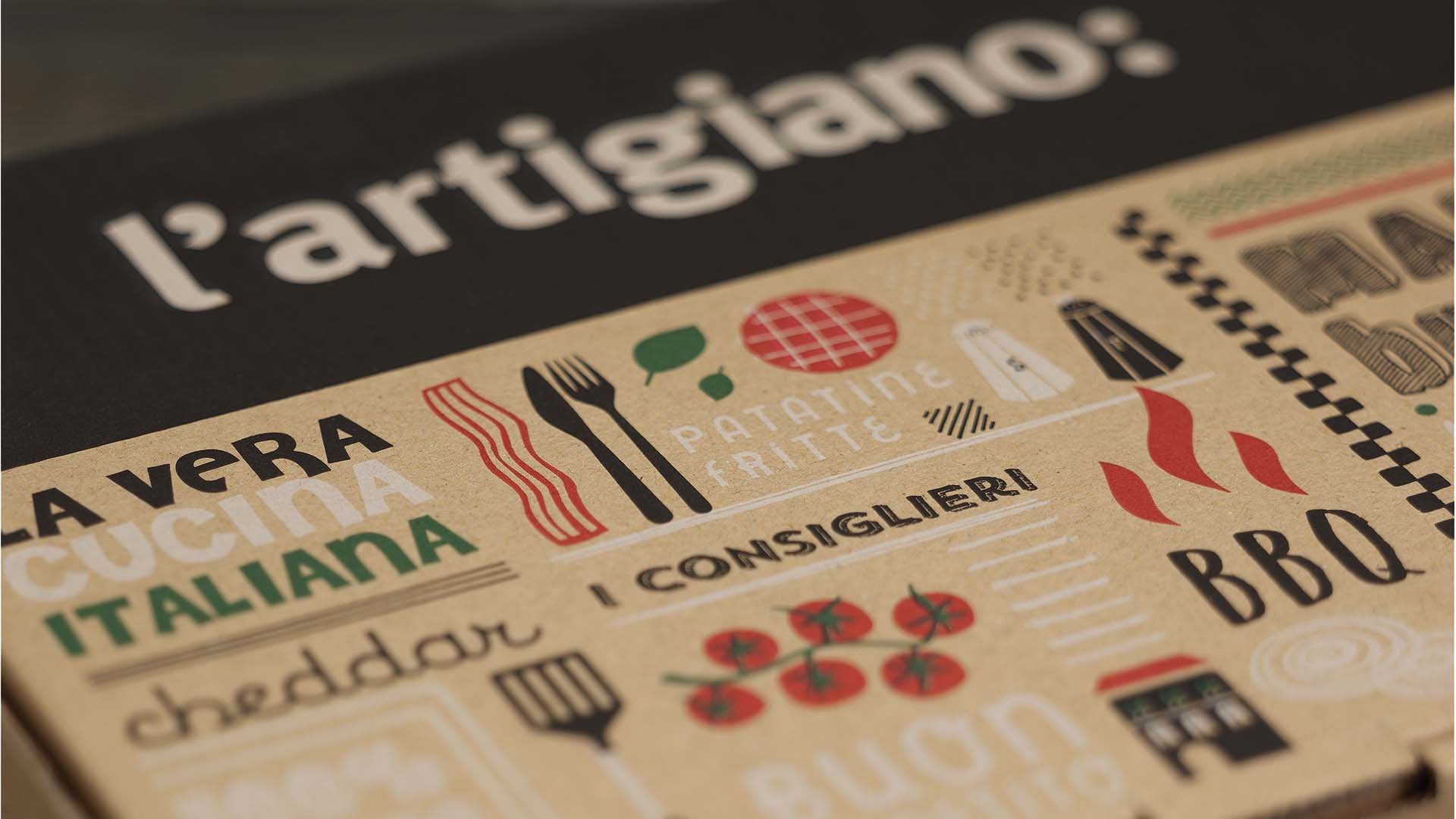
The logotype was redesigned using simple typography paired with a colon punctuation mark thus conveying what L’ artigiano is. We used culinary inspired wording and vivid, custom-made illustrations that depict the key ingredients of each recipe, snugly placed among popular trademarks of the Italian culture. The almost rough, sketch-like illustrations adhere to the spirit of a genuine “artigiano”, meaning craftsman, and created a fresh and solid brand ecosystem that embraced all physical and digital customer touchpoints.
Loading...